The Psychology of Color in Interior Design Schemes for Luxury Yachts
Color choice as a Strategic Asset in Yacht Interiors
Color has become one of the most strategically leveraged tools in yacht interior design, evolving far beyond questions of taste or fashion to operate as a sophisticated language that influences perception, behavior, and ultimately the value of a vessel. For the subscribers and visiting readership of yacht-review.com, which spans owners, charter clients, designers, brokers, and shipyard executives across North America, Europe, Asia, and beyond, understanding the psychology of color is no longer a niche interest but a core competency, particularly as the market for high-end yachts becomes more competitive, more global, and more attuned to wellness, sustainability, and experiential luxury.
Color choices on board a yacht are not merely decorative; they shape how guests experience space, how crew perform under pressure, how families feel at ease in confined environments, and how a vessel is perceived in the charter and resale markets. While technical innovation, hull design, and engineering rightly attract attention in the broader yachting world, the way color operates within an interior scheme can have an equally profound impact on the success of a yacht's design concept and its commercial viability, a reality that is increasingly reflected in the detailed yacht evaluations and design features found on yacht-review.com.
How the Human Brain Responds to Color at Sea
From a psychological standpoint, color is processed in the brain in ways that are both universal and deeply personal. Research in environmental psychology and neuroscience, as summarized by institutions such as Harvard University and University College London, has shown that color can affect mood, cognitive performance, and even physiological responses such as heart rate and perceived temperature. When these findings are transposed to a marine environment, the stakes are heightened, because yacht interiors are closed, often compact, and constantly in use during voyages that may last days or weeks.
On board, color interacts with natural light, reflections from the sea, and the shifting atmospheric conditions that define life on the water. A cool grey that feels sophisticated in a London townhouse can appear cold and flat under the intense Mediterranean sun, while a deep navy that reads as elegant in a New York penthouse may feel overly heavy in a small stateroom on a 30-metre yacht. Designers and owners who wish to leverage color psychology successfully must therefore consider not only theoretical associations but also the specific maritime context, a topic that is increasingly explored in the design-focused coverage on yacht-review.com/design.html.
Scientific and commercial research converge on a key insight: color is never neutral. Warm hues tend to stimulate and energize, cool tones often calm and soothe, and neutrals can either balance or deaden a space depending on their undertones and application. For yacht interiors, where wellness, relaxation, and understated luxury are paramount, the challenge is to orchestrate a palette that supports the intended emotional journey of guests from the moment they step on board to the moment they disembark.
Warm, Cool, and Neutral Palettes: Emotional Signatures on Board
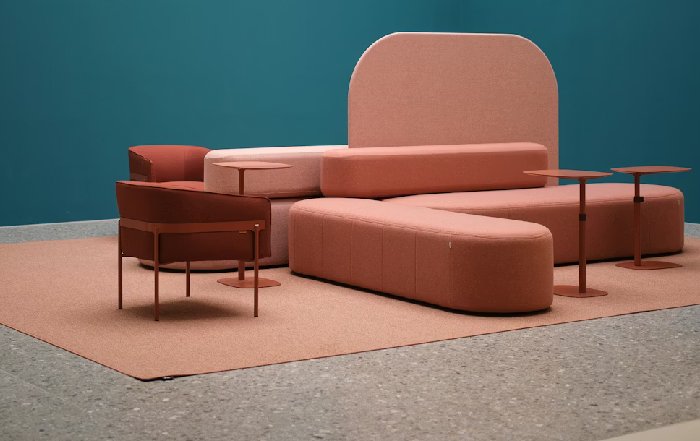
Warm colors such as soft terracotta, muted coral, and gentle gold are often associated with hospitality, conviviality, and a sense of welcome, which is why they frequently appear in saloons, dining areas, and social lounges. In a yachting context, however, these hues must be handled with restraint; overly saturated reds or oranges can feel claustrophobic in smaller cabins or induce visual fatigue in long passages. Contemporary yacht designers increasingly favor desaturated, earthy versions of warm tones that evoke Mediterranean stone, Australian sand, or the sun-baked coasts of Italy and Spain, creating a subtle bridge between interior comfort and exterior landscape.
Cool colors-particularly blues and greens-have a long cultural association with the sea, tranquility, and nature, and they remain a dominant choice for yacht interiors in the United States, United Kingdom, Germany, and the Nordic countries, where understated elegance and a sense of calm are prized. Yet the psychological impact of cool tones is nuanced; while pale blues and soft greens can reduce stress and promote relaxation, overly dark or cold shades can feel austere or even depressing in low-light conditions. Designers who work with premium yards in the Netherlands, Italy, and France often blend cool tones with warm materials such as walnut, oak, or brushed bronze to maintain emotional balance and visual richness.
Neutral palettes-creams, beiges, soft greys, and taupes-have become the default language of many contemporary superyacht interiors, particularly in markets such as the Middle East, Asia, and North America, where timelessness and resale flexibility are key considerations. Neutrals provide a canvas for art, textiles, and accents, yet their psychological effect depends heavily on subtle undertones. A grey with blue undertones may feel crisp and maritime, while one with brown undertones can convey warmth and familiarity. For owners and designers seeking to understand how different neutral schemes perform in real-world conditions, comparative yacht assessments on yacht-review.com/reviews.html offer a practical complement to theoretical color guidance.
Cultural, Regional, and Market Differences in Color Preference
While certain emotional responses to color appear broadly universal, regional and cultural differences play a decisive role in how yacht interiors are received by owners and charter guests from different parts of the world. In East Asia, for example, red has powerful positive connotations linked to prosperity and luck, particularly in China, whereas in some Western contexts it can evoke urgency or aggression if applied too boldly in confined spaces. Similarly, white is associated with purity and modernity in North America and Europe, yet carries mourning connotations in certain Asian cultures, a consideration that can subtly influence preferences for off-white or warmer neutrals in yachts targeting global charter markets.
Markets such as the United States, United Kingdom, and Canada tend to favor restrained palettes with occasional bold accents, reflecting broader interior design trends documented by organizations such as The American Society of Interior Designers and The British Institute of Interior Design. In contrast, owners from Brazil, South Africa, and parts of Southeast Asia may be more open to richer, tropical palettes that echo local landscapes and cultural aesthetics, integrating vibrant blues, greens, and sunset tones in a controlled manner. Understanding these regional nuances is essential for builders and brokers who position yachts for international resale or charter, a topic that intersects closely with the business-focused analysis available on yacht-review.com/business.html.
For European yards and designers working with clients from Germany, Switzerland, the Netherlands, and Scandinavia, there is a growing emphasis on calm, nature-inspired palettes that align with broader societal trends toward wellness, sustainability, and minimalist luxury. Soft greens, stone greys, and muted blues-often combined with natural woods and organic textiles-support a sense of psychological restoration, a concept increasingly validated by environmental psychology research and by wellness studies from bodies such as the World Health Organization, which emphasize the role of restorative environments in mental health.
Zoning the Yacht: Color as a Functional and Emotional Tool
On a well-conceived yacht, color is not applied uniformly but used to articulate zones, support specific activities, and guide emotional states across different decks and spaces. Public areas such as main saloons, sky lounges, and beach clubs typically benefit from palettes that combine approachability with a sense of occasion, while private suites and family cabins often require softer, more enveloping schemes that promote rest and intimacy.
Designers working with leading superyacht yards in Italy, the Netherlands, and Germany frequently treat color as an invisible wayfinding system, subtly differentiating decks and functional areas without overt signage. A slightly warmer palette may define the main deck social spaces, while cooler, more tranquil tones signal wellness areas, spas, or quiet lounges. This kind of chromatic zoning can be particularly effective on larger yachts that host multigenerational families or corporate groups, where guests with different needs and energy levels must coexist harmoniously, a theme that resonates strongly with the family-oriented coverage on yacht-review.com/family.html.
Crew areas also benefit from thoughtful color strategy, even though they are less visible in marketing materials. Studies in occupational psychology and hospitality design, reported by organizations such as Cornell University's School of Hotel Administration, suggest that well-designed staff environments with balanced, non-fatiguing color schemes can improve morale, reduce stress, and support sustained concentration. For yacht operators focused on long-term crew retention and high service standards, investing in psychologically supportive crew interiors-often with cool, clean tones and robust, non-reflective finishes-can pay dividends in operational performance.
Light, Materiality, and the Dynamics of Color at Sea
Color on a yacht can never be considered in isolation from light and materiality. Natural light on the water is sharper, more reflective, and more variable than in urban environments, particularly in regions such as the Mediterranean, Caribbean, and South Pacific. As a result, a color that appears balanced in a shipyard showroom in Northern Europe may shift dramatically when the yacht is anchored off the Amalfi Coast or cruising the islands of Thailand or New Zealand.
Designers and shipyards increasingly rely on advanced visualization tools and real-world mock-ups to test color schemes under different lighting conditions, both natural and artificial. The interplay of gloss, matte, and textured finishes also alters perceived color; high-gloss lacquers can intensify hues but risk glare, while matte finishes may appear more muted yet feel more tactile and restful. For owners keen to understand how these subtleties affect the onboard experience, technology-focused features on yacht-review.com/technology.html often highlight the evolving digital tools and materials science behind contemporary yacht design.
Material choice is equally critical. Warm-toned woods, natural stone, and woven textiles can soften cooler color palettes and prevent them from feeling sterile, particularly in climates like Northern Europe or the Pacific Northwest where light can be subdued. Conversely, in tropical regions such as Singapore, Malaysia, and Brazil, lighter woods, crisp whites, and cooler accents can keep interiors feeling fresh and airy, mitigating the psychological impact of heat and humidity. For deeper insight into how different materials and color strategies have been applied across notable yachts, the curated vessel overviews on yacht-review.com/boats.html provide practical case studies.
Branding, Charter Appeal, and the Business Value of Color
Color decisions in yacht interiors are not only aesthetic and psychological but also commercial, particularly for vessels intended for charter or future resale. A yacht that adopts an overly idiosyncratic palette tied closely to one owner's personal taste may struggle to attract a broad charter clientele or command optimal resale value, especially in sophisticated markets such as the United States, United Kingdom, Monaco, and Singapore where charter guests and buyers have abundant choice.
Charter-focused brokers and consultants frequently advocate for a carefully curated, broadly appealing palette that can be subtly re-personalized with accessories, art, and textiles. Neutrals with layered textures, complemented by regionally adaptable accent colors, tend to perform best across global markets, as evidenced by the charter success stories and market analyses documented by organizations such as Fraser Yachts, Burgess, and Camper & Nicholsons. Owners and managers who wish to understand how color influences charter performance can also benefit from the market insights published on yacht-review.com/global.html, where regional demand patterns and aesthetic preferences are often discussed.
From a branding standpoint, color can reinforce a yacht's identity, particularly for vessels associated with corporate ownership, luxury hospitality groups, or high-profile individuals. Subtle integration of brand colors-through accent fabrics, artwork, or decorative elements-can create a coherent narrative without overwhelming the interior. This approach parallels broader trends in luxury hospitality and retail, where color is used to convey brand values such as innovation, heritage, or sustainability, themes frequently explored by institutions like The Luxury Institute and McKinsey & Company in their analyses of global luxury markets.
Wellness, Neuroscience, and the Rise of Restorative Palettes
The last decade has seen a significant shift in yacht design toward wellness and holistic onboard living, driven by rising client expectations in markets from North America and Europe to Asia-Pacific. Color plays a central role in this movement, as owners and designers seek to create interiors that actively support mental and physical wellbeing rather than simply impress visually. Research in neuroaesthetics and biophilic design, highlighted by organizations such as The International WELL Building Institute, underscores the importance of nature-inspired palettes, gentle contrasts, and visual coherence in reducing stress and enhancing relaxation.
On many new-build and refit projects, spa areas, gyms, and wellness suites are now treated as sanctuaries, with carefully calibrated palettes of soft greens, muted blues, and warm neutrals that echo natural landscapes-from Nordic fjords and New Zealand coasts to Mediterranean coves and Caribbean reefs. These schemes are often paired with organic materials, diffused lighting, and minimal visual clutter to create spaces that feel psychologically restorative, an approach that aligns with broader lifestyle trends documented on yacht-review.com/lifestyle.html.
Sleep quality has become a particular focus, especially for long-range expedition yachts and vessels undertaking transoceanic passages. Bedrooms and owner's suites benefit from darker, cocooning tones that minimize light reflection and promote melatonin production, while still maintaining a sense of luxury and space. Designers increasingly draw on hospitality and aviation research into circadian lighting and color temperature, integrating adjustable LED systems that shift from cooler, energizing tones during the day to warmer, relaxing hues in the evening. Those seeking to explore how such innovations translate into real-world cruising experiences can find complementary perspectives in the travel-oriented features on yacht-review.com/travel.html.
Sustainability, Ethical Luxury, and the Future of Color
As environmental responsibility becomes a defining theme in the global yachting industry, color is intersecting with sustainability in ways that go beyond surface aesthetics. Eco-conscious owners and charterers increasingly look for interiors that visually express a commitment to the oceans and to responsible luxury, favoring palettes inspired by natural materials, coastal landscapes, and subtle, enduring tones rather than synthetic or excessively trend-driven schemes. This shift aligns with broader sustainable design principles promoted by organizations such as the U.S. Green Building Council and the Ellen MacArthur Foundation, which emphasize longevity, recyclability, and thoughtful material selection.
In practical terms, this means greater use of naturally derived pigments, low-VOC finishes, and textiles produced with reduced environmental impact, often in colors that age gracefully and can be refreshed without extensive refit. Earthy neutrals, sea-glass greens, and soft blues not only resonate with the marine environment but also support the narrative of responsible ownership that increasingly influences purchasing decisions in Europe, North America, and Asia. Readers interested in the intersection of color, materials, and environmental responsibility can explore related editorial coverage on yacht-review.com/sustainability.html, where sustainable design strategies are examined in depth.
The social dimension of sustainability is also coming into sharper focus. Color choices that create inclusive, comfortable environments for diverse guests-from multigenerational families to corporate groups and international friends-support the broader goal of yachts as platforms for shared experiences rather than solitary status symbols. This community-oriented perspective, reflected in the growing emphasis on shared spaces, flexible layouts, and welcoming palettes, aligns closely with the values highlighted on yacht-review.com/community.html, where the human side of yachting life is a recurring theme.
Integrating Color Psychology into the Design Process
For owners, designers, and shipyards navigating complex new-build or refit projects in 2026, integrating color psychology into the design process requires both expertise and a structured methodology. Successful projects typically begin with a clear articulation of the yacht's intended use-private, charter, or mixed-its primary cruising regions, and the cultural backgrounds of its likely guests. From there, designers can develop a color strategy that aligns emotional goals with practical constraints, testing palettes across digital visualizations, material samples, and, where possible, physical mock-ups that simulate real onboard conditions.
Collaboration between naval architects, interior designers, lighting specialists, and even branding consultants ensures that color decisions support the overall design narrative and technical realities of the vessel. For example, weight considerations, maintenance requirements, and safety regulations may influence material and finish choices, which in turn affect color perception. Owners and project managers who wish to follow how leading yards and design studios navigate these complexities can look to the project coverage and industry updates on yacht-review.com/news.html and yacht-review.com/events.html, where emerging trends and best practices are regularly discussed.
Ultimately, the psychology of color in yacht interiors is not about rigid rules or universal formulas but about informed, context-sensitive decisions that respect both scientific insight and personal preference. As yacht-review.com continues to document the evolution of yacht design, technology, and lifestyle across global markets, one theme is becoming increasingly clear: in the most successful yachts of this decade, color is not an afterthought but a foundational element of experience, expertise, authoritativeness, and trustworthiness in design, shaping how the world's most discerning owners and guests feel the moment they cross the passerelle.